Image via Rio De Janeiro Sun.
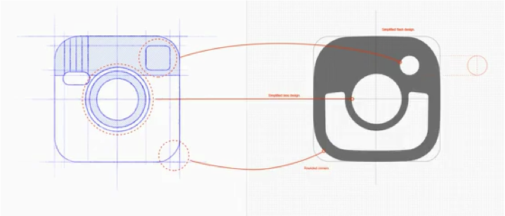
In the recent weeks, we are sure that you have noticed some major changes to one of the world’s top social media apps. We are talking about Instagram, of course. The highly popular photo sharing app recently debuted a complete design overall with its latest update. Gone is the iconic Polaroid photo, replaced by a colorful gradient background and more monochromatic design, a slight reference Instagram’s older designs iconic rainbow.
Since it inception and debut five years ago, the Facebook-owned app has been both a tool and platform for people around the world to share what they do, eat, feel and experience. Now, with the simplicity of the new design, users can share their images on a blank, canvas-like medium.
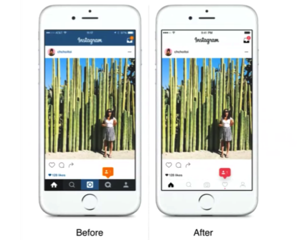
Other features that have been rebooted are Instagram’s Layout, Boomerang and Hyperlapse . Instagram changed the white gradient scheme to help users differentiate between these additives and the main app. They have also altered the blue header that was previously a part of Instagram’s branding and replaced it for a pure black and white design. Many of the original buttons will remain in the same positions, and pops of color are still shown to highlight things like notifications, user requests and “likes”. Additionally, Instagram will now use standard iOS and Android components, fonts and patterns.

Image via TechCrunch.
With this scaled back layout changes and design modifications, the idea behind the revamp is to allow the users more freedom and focus towards the photo and videos themselves. Specifically artists and photographers can rejoice as previous colors and design elements were considered a distraction from the viewing experience.

Image via TechCrunch.
Reaction for the new deign has been mixed, with some calling it bland and flat, while others are applauding Instagram for catering to the creativity of its users. Whatever the response may be, the re-design is here to stay and we are excited for the continued ingenuity the app will roll out for the future.
Like this post? Check out past blogs in the archive below.
